Project Overview

Challenge

As a small nonprofit organization, Yoga in the Rock brings together local communities through donation-based yoga classes. Although they have an online presence, users don't have a means to register for classes in advance or the ability to sign the waiver and release of liability.
Outcome

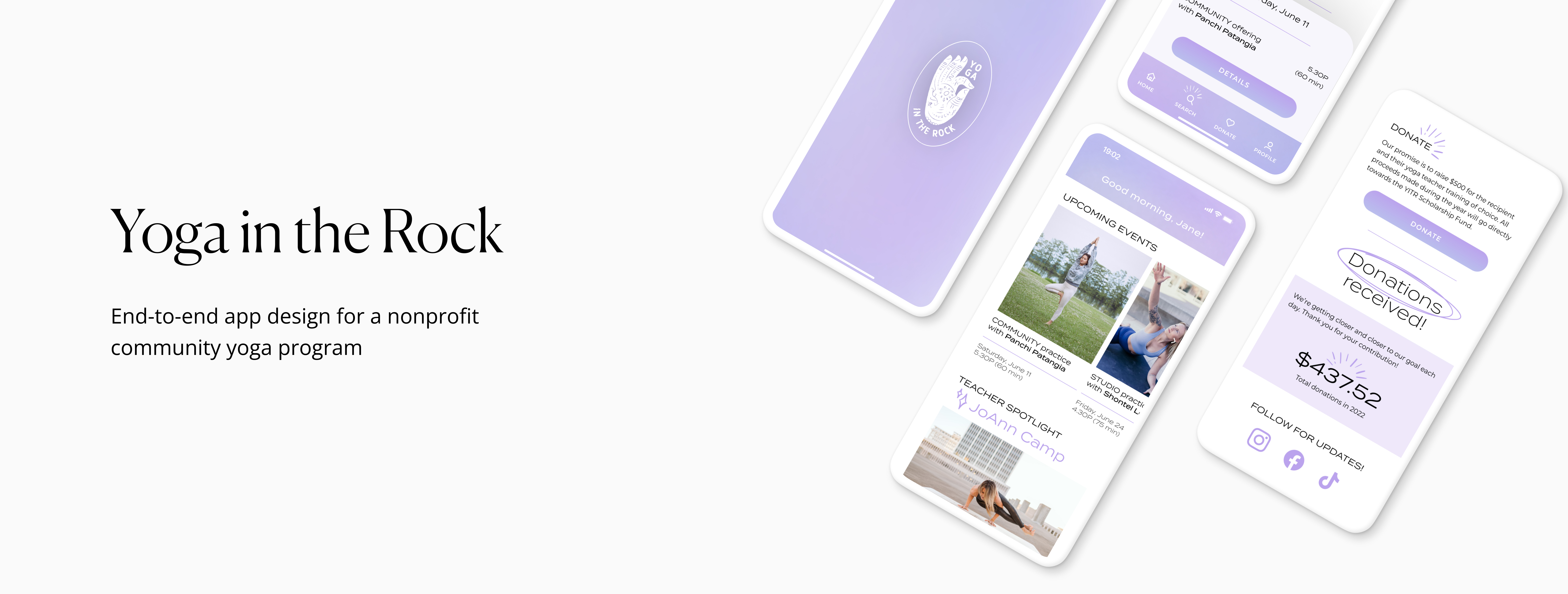
Expand Yoga in the Rock's online presence by creating an app that offers students the ability to register for classes, find upcoming events, and donate to the scholarship fund directly online. Created a frictionless flow that appeals to users and motivates them to care for their health and well-being, while also cultivating additional contributions for Yoga in the Rock’s scholarship fund.
CATEGORY
App Design
App MVP
End to End

MY ROLE
UX Designer
UX Researcher
Logo Redesign

TOOLS
Photoshop
Figma
Miro
VIEW PROTOTYPE

DISCOVERY

Research
Competitive Analysis
Surveys
User Interviews

DEFINE

Themes and Insights
Affinity Map
Task Flows

DESIGN

Ideation
Wireframes
Visual Design

TEST

Interactive Prototype
Usability Testing

Research and discovery

This project began with questions to begin to understand the problem space at hand. How might we help users sign up for community yoga classes with ease — while also helping a small non-profit attract a wider audience to help donate to their cause? The following questions helped organize and guide the research, and was used as the basis for the one-on-one interviews.

◇ How likely is a user to use a digital app to signup for a yoga class vs. dropping in?
◇ What is the user’s opinion of their experience when signing up for a yoga class? How easy is it? 
◇ What motivates the user to use the app?
◇ What creates a good experience for the user?
◇ What are the main pain points for the user?

After determining the right questions to ask, I began to make plans for my research goals and methodologies that would help me start forming a solution.

Users value notifications and calendar syncs that reflected changes instantly

My research led me to explore the world of yoga and fitness apps, in particular, the ones that offered scheduling services. After delving into the apps, reading reviews, and assessing what types of services they offered, I created a competitive analysis summarizing my research.

Overall, these particular apps use simple calendars to help users register for classes— and each class is sorted by date and time. Easy sign-in and the ability to favorite teachers, classes and studios was very important to users, according to reviews. Users also valued notifications and calendar syncs that reflected changes instantly. However, many users complained about not having waitlist options and the lack of images of the actual studio spaces. Lastly, the indirect competitor offered a a library of live streaming and pre-recorded classes to watch and a simple interface that was easy to use which inspired me to include some aspect of of an online class, if it was feasible.
STRENGTHS 
◇ Schedule booking and reservations with ease
◇ Notify user when appointment is booked, rescheduled or cancelled
◇ Calendar sync

WEAKNESSES
◇ Lack of quality customer support
◇ No waitlist option if class if full
◇ Expensive monthly fees

Users motivated by knowing that their class is booked and confirmed

I interviewed five individuals, with varying degrees of interest in yoga. During the interviews, I began to to understand their frustrations and joys which helped me to begin to visualize what types of functionality the app would require to be a success. I learned so much with each interview, from personal preferences, new ideas, and the motivating factors that inspire a user to interact with an app.

Overall, it became clear that users would prefer to to sign-up for a class using the app, instead of showing up in real life, hoping there is enough space for all. They were motivated by the ease of the process and the security of knowing that their class was booked and confirmed.

What makes a yoga scheduling app helpful? 

Most users prefer to sign-up for a yoga class online, every single time

I created a mostly quantitative survey using Google Forms and collected data from a pre-defined group of 30 individuals. Most of the questions were structured and the survey targeted users that signed up for yoga and fitness classes somewhat regularly. After eliminating any incomplete responses, my findings led to a few key insights that tied closely to the business goals of Yoga in the Rock.

◇ 94% of participants would rather signup online, than drop-in
◇ 77% of participants have signed up for a yoga class in the last month
◇ 33% of participants use the MindBody app
◇ 28% of participants have had frustrating experiences with signup apps
◇ 22% of participants signup 3-7 times a week or more

Finding patterns within the data

By isolated several pieces of my collected data, such as small documented facts, quotes, and observations on post-its, I created an affinity map. This process helped me discern patterns within the research and simplified the process of grouping similar topics together. In addition, affinity mapping was particularly helpful in bringing the data to life and organizing my findings.
Below, a small sample of a few of the observations made and patterns found within the data.

Users prefer fewer clicks and a simple signup process

By using a task flow, I documented the steps a user would potentially take to get to specific goal within the app — in this case, signing up for a community class and paying / donating to the scholarship fund. By creating a task flow that is both relatively linear and sequential, I was able to visualize exactly what pages I'd need to develop for the user to complete the task with ease.

Visualizing the flow

After sketching out my initial design ideas, I digitized them into wireframes to help me visualize the flow. During the wireframe process, I made sure to include a calendar, options to filter by date, and upcoming events. I also incorporated common app patterns such as a consistent menu and clear icons to improve app usability. Additionally, I also added a page that allows users to simply donate, without the requirement of signing up for class.

Design consistency and brand equity

Understanding the importance of a design system was paramount to the success of Yoga in the Rock and would help the brand maintain as sense of overall consistency and brand equity. The process of developing the design system and UI kit was created though constant iterations, receiving feedback, and offering the work up for design critiques.

Users complete task with 100% accuracy

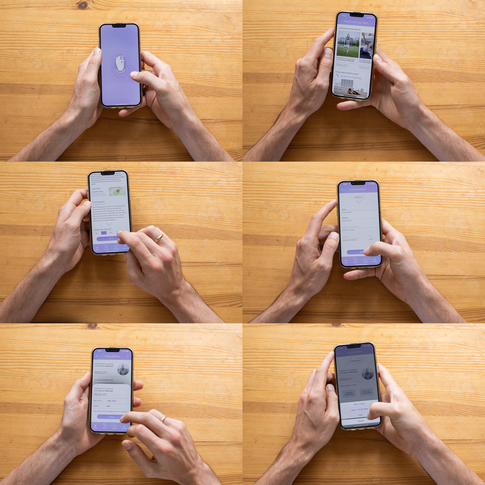
With my UI designs ready, I created a high-fidelity prototype for usability testing. The core task was straightforward, asking users to book a yoga class. The goal for usability testing was to evaluate the user's interactions with the app, identifying current and possible future pain points and the success of navigation, flow, architecture, and design. And each of the five users completed the task successfully.

By doing in-person testing, I was able to gather several key findings, by chatting directly with the users and by perceiving their non-verbal cues during the test. Each user was able to complete the task with 100% accuracy. Although the tests were successful, lots of smaller adjustments needed to be made. For example, changing the language around the donations — and creating a CTA that made it easily accessible, adding social media links for each teacher, adjusting visual hierarchy within the class details page, and using clarifying language when describing the types of classes.

Test Objectives

◇ Observe and test users' impressions about the overall usability of the app

◇ Test overall flow from onboarding to booking a yoga class

◇ Identify pain points and opportunities for improvement

Methods

◇ In-person and moderated

◇ Subjects will test the Figma prototype on designer's iPhone and will be recorded for both their voice and actions as they work through the task

Task

◇ User task: Book a yoga class on a specific date

Prototyping and final iterations


The key findings from the usability testing led to several reiterations of the project, eventually leading to the final version of the prototype, featured below.

FIGMA PROTOTYPE

Retrospective

Overall, by keeping user success and business goals at the forefront of the design process, the project was a success, despite time constraints. However, there are a few things I would consider changing or developing further, with more time and resources.
◇ Develop the ability to stream pre-recorded classes or guided meditations
◇ Incentivize taking class with a loyalty program, rewarding the user
◇ Create a progress infographic tracking classes attended within user profile
◇ Add more micro-interactions within the flow to add more visual interest
Three mobile mockups showing the YITR app.
Have questions about this project? I'd love to chat about it.
CONTACT
An arrow pointing upwards.
© 2025   ✷   Arshia Khan